When pressed, reducing text darkness is often said to be good for dyslexics. Here are what the articles I found actually tested and recommended.
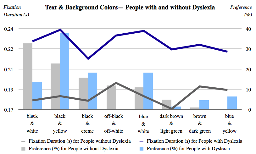
Each of the color pairs were presented in random order containing different comparable texts. black (000000) & white (FFFFFF)
Each of the color pairs were presented in random order containing different comparable texts. black (000000) & yellow (FFFF00)
Each of the color pairs were presented in random order containing different comparable texts. black (000000) & creme (FAFAC8)
Each of the color pairs were presented in random order containing different comparable texts. off-black (0A0A0A) & off-white (FFFFE5)
Each of the color pairs were presented in random order containing different comparable texts. blue (00007D) & white (FFFFFF)
Each of the color pairs were presented in random order containing different comparable texts. dark brown (1E1E00) & light green (B9B900)
Each of the color pairs were presented in random order containing different comparable texts. brown (282800) & dark green (A0A000)
Each of the color pairs were presented in random order containing different comparable texts. blue (00007D) & yellow (FFFF00)
There’s a reason the text you’re reading now is not pure black (#000000), and the background is not pure white (#FFFFFF). It’s because many dyslexic users are sensitive to the brightness the high contrast colors cause. This can cause the words to swirl or blur together [3].
To avoid this, use an off-white color for your background, like light gray or tan. You can also use a dark gray for your text instead of pure black to cut the glare even more.
Background color
Many dyslexic readers are particularly sensitive to the brightness of text on a pure white background. This can cause the words to appear to move around and to blur together.
This difficulty can be avoided if pure white is not used for the page background color. A slightly off-white color can easily be achieved (with the code BGCOLOR="#FFFFFC"). Text is also harder to read on a patterned or tiled background.
For pages which are heavily used by dyslexic adults or teenagers, a backgound color changer can be added to a page, like the one at the top of this page (which may be freely copied by any other web designer).